Have you checked these first?
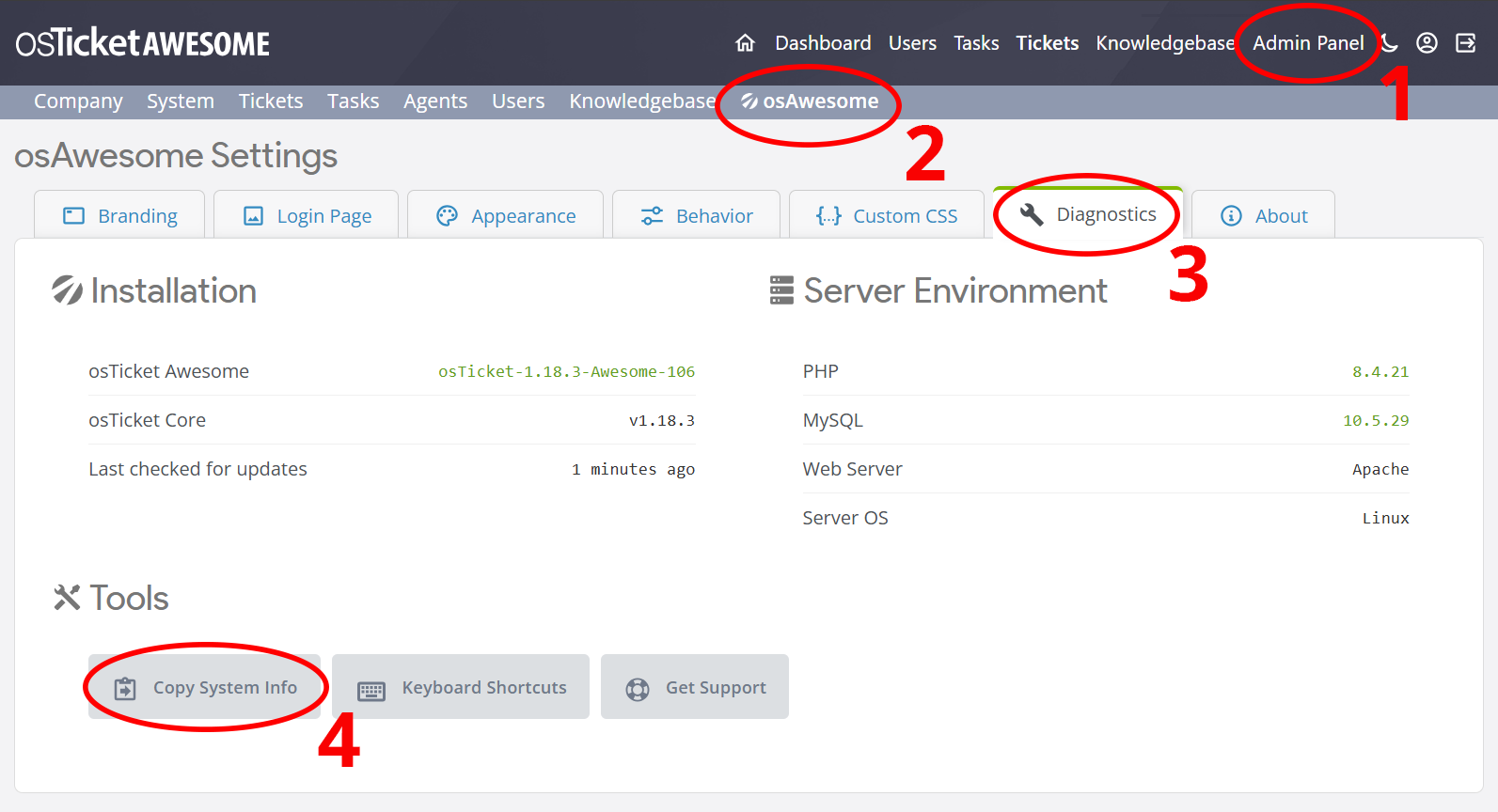
Help us help you: include your environment details. We've made this easy for you. Use the Copy System Info button in Admin Panel › osAwesome › Diagnostics, then paste below.
Note: Never paste the contents of your ost-config.php file here; it holds your database credentials.
Two quick checks before posting: try clearing your browser cache, and press SHIFT+O on any Staff Panel page to enter Safe Mode (a stock osTicket with no enhancements). If the problem still shows in Safe Mode, it's in osTicket itself, not osTicket Awesome. But let us know about the issue either way.
Help us help you: include your environment details. We've made this easy for you. Use the Copy System Info button in Admin Panel › osAwesome › Diagnostics, then paste below.
This forum is public. Never post order numbers, full license keys, email addresses, or payment details.
This is the place for general questions about how billing and licensing work — renewals, activation, staging slots, plan differences, and what happens when a license lapses.
For anything tied to your specific account, refund, or payment, contact us directly instead.
Can you point me in the right direction to change (darken) the color of the menu font so as to make it easier to read? I've inserted a screenshot of what it looks like now. It would be nice if the dropdown menu items were darker as well (not visible in sample).
Thanks

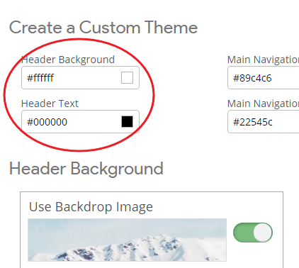
Header Text configures the color of the font used for the links in the header and the links in the drop-down menus.
Header Background configures the background color of the submenus.
I hope this helps!
I think that is what it is already set to. Could you confirm?
Yes, you are already using the settings with the most contrast.
But have you somehow changed the font that is used? It looks quite different from what I would expect to see. The font is super thin, but the bold item is super bold.
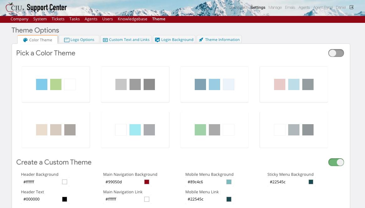
For comparison, here is what it looks like using your chosen background image in a standard osTicket Awesome installation:

Obviously, it still isn't ideal as the background doesn't provide a lot of consistent contrast. But it looks better than what you have.
You can add the following to /osta/user-styles.css:
#header a {
font-weight: 400;
}
That will make the font of all menu items bold, rather than just the current item.
If you still aren't happy with that, you should consider turning off Header Background > Use Backdrop Image
You can try adding:
#nav.pull-right .active a {
font-weight: 700;
}
...but it is dependent on the font that is being displayed and if it supports a font-weight above 400 or not.