
Logo Tips
Get your company logo looking sharp in osTicket Awesome’s header. Here’s what works and what doesn’t.
Where to set your logo: Admin Panel → Settings → Company → Upload Logo. osTicket Awesome displays your logo in the top-left corner of the helpdesk header, scaled to fit the navigation bar height.
1 Company Logo
This is what happens when you upload a logo with a lot of whitespace around it. The header scales the entire image to fit, so all that empty space shrinks the actual logo down to nearly nothing.
 ✗ Source image
 ✗ Result in header
2 Logo Cropped
Crop the image tightly around the logo before uploading. Now the header scales the actual logo, not the whitespace. Much better.
 ✓ Source image
 ✓ Result in header
3 Transparent Background
Use a PNG with a transparent background. If your logo has a solid white or coloured background, it will show as an ugly rectangle in the header.
 ✓ Transparent PNG
 ✓ Blends into header
Quick fix: If your logo has a solid-colour background, most image editors can remove it. In Photoshop, use the Magic Wand tool on the background. Free tools like remove.bg do this automatically.
4 Color Overlay
If parts of your logo are the same colour as the header background, those parts will disappear. A multicoloured logo usually works fine, but a single-colour logo may need a colour overlay or slight outline to stay visible.
 ✓ Overlay ensures contrast
 ✓ Visible against any header
5 Tall Logo
The header bar is wide and short. A tall or stacked logo gets scaled down to fit the bar height, making it appear tiny and unreadable.
 ✗ Tall source image
 ✗ Too small in header
6 Short Logo
Use the horizontal lockup version of your logo (icon + text side-by-side). A wide, short image fills the header space properly and stays readable.
 ✓ Wide source image
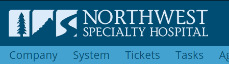 ✓ Fills header properly
Checklist
Cropped tightly, transparent PNG, colours contrast with the header, and wider than it is tall. Get all four right and your logo will look sharp.