Have you checked these first?
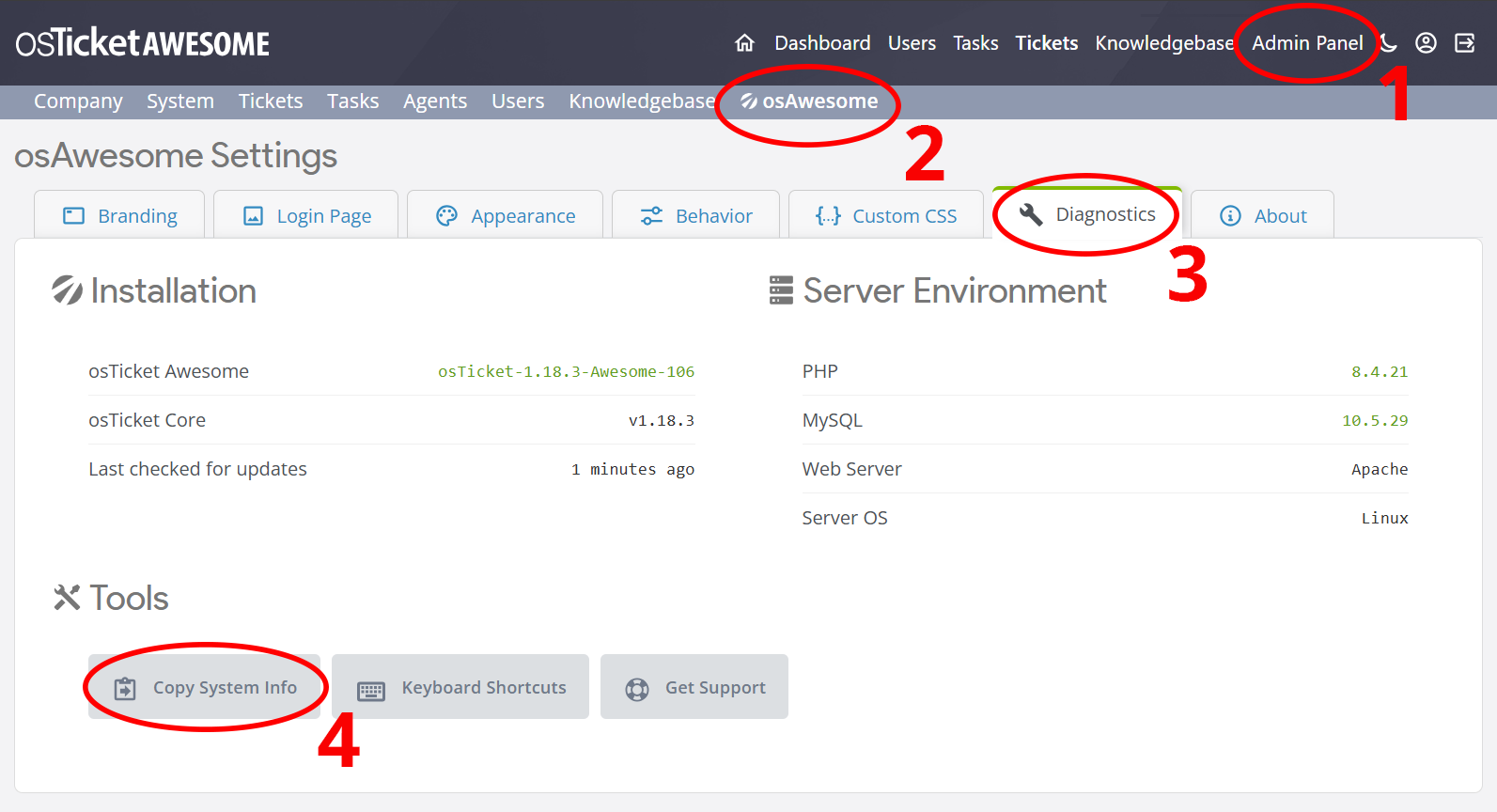
Help us help you: include your environment details. We've made this easy for you. Use the Copy System Info button in Admin Panel › osAwesome › Diagnostics, then paste below.
Note: Never paste the contents of your ost-config.php file here; it holds your database credentials.
Two quick checks before posting: try clearing your browser cache, and press SHIFT+O on any Staff Panel page to enter Safe Mode (a stock osTicket with no enhancements). If the problem still shows in Safe Mode, it's in osTicket itself, not osTicket Awesome. But let us know about the issue either way.
Help us help you: include your environment details. We've made this easy for you. Use the Copy System Info button in Admin Panel › osAwesome › Diagnostics, then paste below.
This forum is public. Never post order numbers, full license keys, email addresses, or payment details.
This is the place for general questions about how billing and licensing work — renewals, activation, staging slots, plan differences, and what happens when a license lapses.
For anything tied to your specific account, refund, or payment, contact us directly instead.
G'day @stevland,
Just a few more visual issues. Maybe there is a better way to deal with them as I find them. Otherwise I'm starting a lot of different forum posts. A private github maybe?? That would be brilliant. If you fork the latest osTicket and then have everything in there. Anyway I digress 🙂
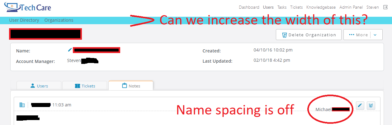
So the screen shot below shows the issue. It happens on any notes either in Company or Users.
Another thing I've noticed is that when I'm in Dashboard or else where and hover over the top tab "Users" it drops down with Users and Company. If i try this when I'm in Users OR Company it does NOT do this. Not a huge deal but just not the same principle across the board.
Lastly as you can see with the picture. That band which is blue can we enlarge this a little bit. Looks too small to me. Also would be good to have the lettering behind it stand out more.
No rush. Just cosmetics. 🙂
Hi @techcare,
Regarding the name spacing, I'll have that section all fixed up in the next release:
Another thing I’ve noticed is that when I’m in Dashboard or else where and hover over the top tab “Users” it drops down with Users and Company. If i try this when I’m in Users OR Company it does NOT do this. Not a huge deal but just not the same principle across the board.
The navigation in osTicket is inconsistent and confusing. I recently submitted a bug report pointing out a similar inconsistency, but unfortunately it was rejected.
A part of me wants to overhaul the navigation system and make it more consistent, it is something that I have definitely considered. But I have to consider all of the long-term implications of doing so. I try to modify osTicket's core functionality as little as possible, and when I do it is almost always to address design and layout issues. Hopefully Enhancesoft will address the navigation inconsistency in the source code.
Lastly as you can see with the picture. That band which is blue can we enlarge this a little bit. Looks too small to me. Also would be good to have the lettering behind it stand out more.
I can't figure out what you are referring to re: "Can we increase the width of this?". Do you mean, "increase the height (and font-size)"?
Yeah I can understand that.
I would totally be happy to pay toward them implementing core upgrades and keeping it current. For example merging tickets... argh what a pain. Plus there are soooo many other issues to it that really should be ironed out by now.
Anyway I'm happy with your response mate. Thank you.
As for the last point here is what I mean. I can dabble with dev tools on Chrome, but it's trial and error not in anyway clean and nice.
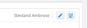
As you can see it is just a little wider and to me seems more aesthetically pleasing.
Best regards,
Steve
Hmmm. It's obviously a subjective thing, because I prefer it thinner myself. But I will take it under advisement!
Oh that could very well be 🙂
Even if you could give some code to add the user file again that would be epic.
Sorry, not in this instance.
It probably looks like something that would be easy to do. But it's like asking to change the support beam in a building.