Have you checked these first?
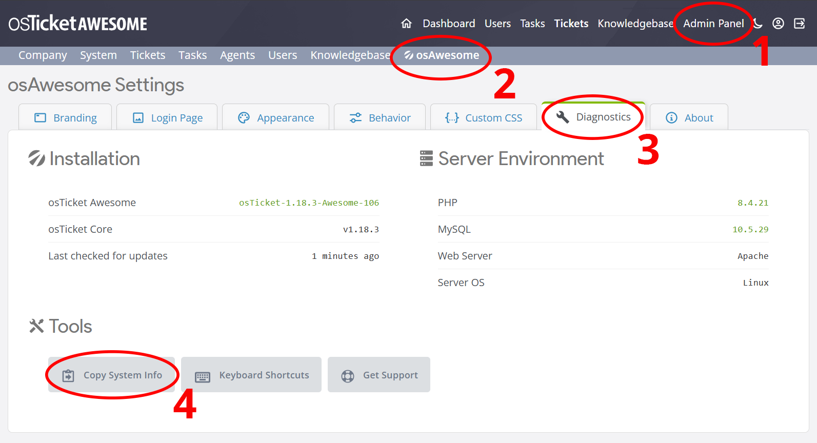
Help us help you: include your environment details. We've made this easy for you. Use the Copy System Info button in Admin Panel › osAwesome › Diagnostics, then paste below.
Note: Never paste the contents of your ost-config.php file here; it holds your database credentials.
Two quick checks before posting: try clearing your browser cache, and press SHIFT+O on any Staff Panel page to enter Safe Mode (a stock osTicket with no enhancements). If the problem still shows in Safe Mode, it's in osTicket itself, not osTicket Awesome. But let us know about the issue either way.
Help us help you: include your environment details. We've made this easy for you. Use the Copy System Info button in Admin Panel › osAwesome › Diagnostics, then paste below.
This forum is public. Never post order numbers, full license keys, email addresses, or payment details.
This is the place for general questions about how billing and licensing work — renewals, activation, staging slots, plan differences, and what happens when a license lapses.
For anything tied to your specific account, refund, or payment, contact us directly instead.
Hello,
the logo position on mobile view iPhone/iPad is displaced. I can´t click the menu options behind the logo. Tested it with text logo and our jpg company logo.

osTicket v1.14.1 // osTicket-1.14.1-Awesome-102<br />
PHP 7.3.11 // MySQL 10.3.21 // Apache/2.2.34 (Unix) mod_fastcgi/mod_fastcgi-SNAP-0910052141 web server
Hi,
This happens when the Deutsch language pack is used because some German words (such as 'Wissensdatenbank') are so long!
I will include a fix in the next release, but for now you can add the following to /osta/user-styles.css:
@media screen and (max-width: 979px) {
html[lang="de"] #left-logo {
max-width: 280px;
}
html[lang="de"] #header a {
font-size: 11px;
}
html[lang="de"] #header #nav a[href*="/profile.php"] {
font-size: 0px;
width: 14px;
display: inline-block;
}
html[lang="de"] #header #nav a[href*="/profile.php"] svg {
display: inline-block;
fill: var(--header-title-color);
width: 18px !important;
height: 18px !important;
content: "";
position: relative;
top: 4px;
margin: 0 2px 0 -4px;
}
}
But please do not forget to remove this from /osta/user-styles.css the next time you upgrade.