Have you checked these first?
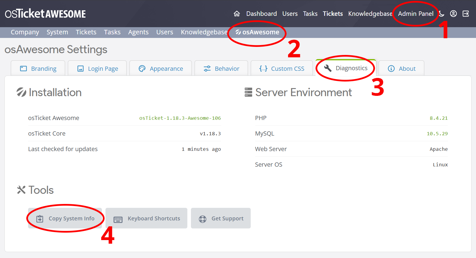
Help us help you: include your environment details. We've made this easy for you. Use the Copy System Info button in Admin Panel › osAwesome › Diagnostics, then paste below.
Note: Never paste the contents of your ost-config.php file here; it holds your database credentials.
Two quick checks before posting: try clearing your browser cache, and press SHIFT+O on any Staff Panel page to enter Safe Mode (a stock osTicket with no enhancements). If the problem still shows in Safe Mode, it's in osTicket itself, not osTicket Awesome. But let us know about the issue either way.
Help us help you: include your environment details. We've made this easy for you. Use the Copy System Info button in Admin Panel › osAwesome › Diagnostics, then paste below.
This forum is public. Never post order numbers, full license keys, email addresses, or payment details.
This is the place for general questions about how billing and licensing work — renewals, activation, staging slots, plan differences, and what happens when a license lapses.
For anything tied to your specific account, refund, or payment, contact us directly instead.
Love the new update! However even on the new update the ID and I guess the preview button overlap. Here is a screenshot of what it is doing for me. https://imgur.com/a/k9dkQ
Thanks
Keep up the great work!
Jon
Hey, so it doesn't happen for me on the demo page. Mostly what gets used is chrome, but FF and Safari display it as well. I will do some investigation and see what I can find out on my end. It may be an issue left over from before the update, I don't think I have gotten any new tickets since then. I will let you know what I find.
Jon
Perhaps you can open /osta/css/staff-desktop.css and look for the following code (it should be around line 2439):
.Icon.Ticket, .Icon.emailTicket,.Icon.phoneTicket,.Icon.webTicket, .Icon.otherTicket {
border: .2px solid;
padding: 4px 3px 0px 3px;
background: rgba(255, 255, 255, 0.4);
font-size: 10px;
margin: 9px;
}
Change that code to…
.Icon.Ticket, .Icon.emailTicket,.Icon.phoneTicket,.Icon.webTicket, .Icon.otherTicket {
border: .2px solid !important;
padding: 4px 3px 0px 3px !important;
background: rgba(255, 255, 255, 0.4) !important;
font-size: 10px !important;
margin: 9px !important;
}
…and save.
It is a mystery to me why this isn’t displaying properly on your end, but let’s see if this fixes it. If it does, I’ll incorporate this change into the next release.
Ok, I tried that and it didn't make a difference. I did a little digging and I think it might have to do with API submitted tickets. When I create a new ticket through an email the preview ID is fine, but when I create one using the API, it breaks. Here is a link that shows the difference between them. https://imgur.com/a/ffQd3
Thanks for figuring that out, Jon!
I sent you a private message regarding this.
In your last screenshot I notice your company name is still set to osTicket Awesome.
You know you can change that in Admin Panel > Theme, right?! 🙂
<p>Haha I didn't even notice. It is fixed now, thanks for noticing. </p>
Hi, we have the same issue with tickets submitted by API, seemingly there is a fix for it. Could you please share them with me.
Thank you very much.
Gerald
Hi there,
We have the same issue here, could you please share the solution to fix it?
Regards,
I’m very surprised that anyone who is running a recent release is seeing this issue.
But here is a nuclear fix.
Copy / paste the following to Admin Panel > Theme > Custom CSS:
.Icon.apiTicket {
background: none;
margin-left: 0;
}
a.Icon.apiTicket.preview {
margin: 0 0 0 12px;
margin: 0;
}
a.Icon.apiTicket.preview b {
font-weight: normal;
font-size: 10px;
font-family: 'Open Sans', sans-serif;
}
table.list.queue.tickets a.Icon.apiTicket.preview {
font-weight: 400;
border: .5px solid #128dbe;
border-radius: 2px;
padding: 2px 3px 2px 3px;
background: #ffffff7a;
margin: 0;
font-size: 10px;
}
If it doesn’t work, let me know!