Have you checked these first?
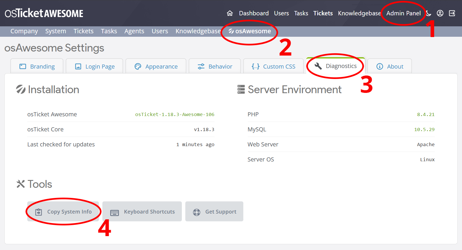
Help us help you: include your environment details. We've made this easy for you. Use the Copy System Info button in Admin Panel › osAwesome › Diagnostics, then paste below.
Note: Never paste the contents of your ost-config.php file here; it holds your database credentials.
Two quick checks before posting: try clearing your browser cache, and press SHIFT+O on any Staff Panel page to enter Safe Mode (a stock osTicket with no enhancements). If the problem still shows in Safe Mode, it's in osTicket itself, not osTicket Awesome. But let us know about the issue either way.
Help us help you: include your environment details. We've made this easy for you. Use the Copy System Info button in Admin Panel › osAwesome › Diagnostics, then paste below.
This forum is public. Never post order numbers, full license keys, email addresses, or payment details.
This is the place for general questions about how billing and licensing work — renewals, activation, staging slots, plan differences, and what happens when a license lapses.
For anything tied to your specific account, refund, or payment, contact us directly instead.
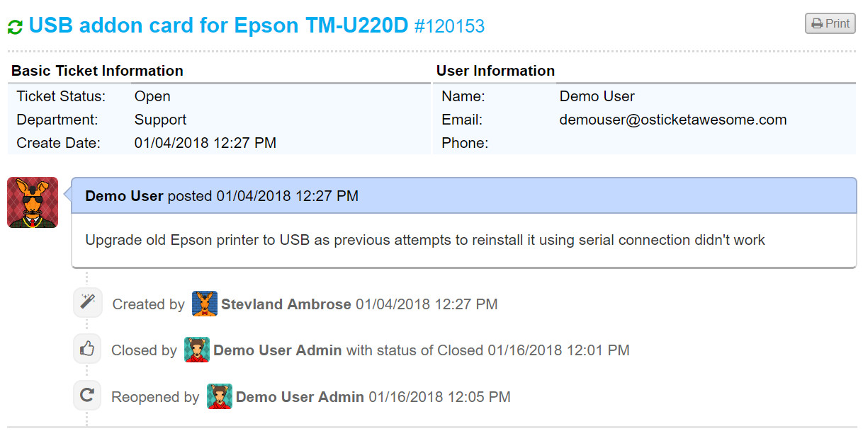
Ticket info table from client side is pretty ugly not being "stylized" by CSS
In the meantime, in order to improve the appearance we've applied...
class="ticket_info"
...to the table at include\client\view.inc.php (line 30)
Hi @aeromarine,
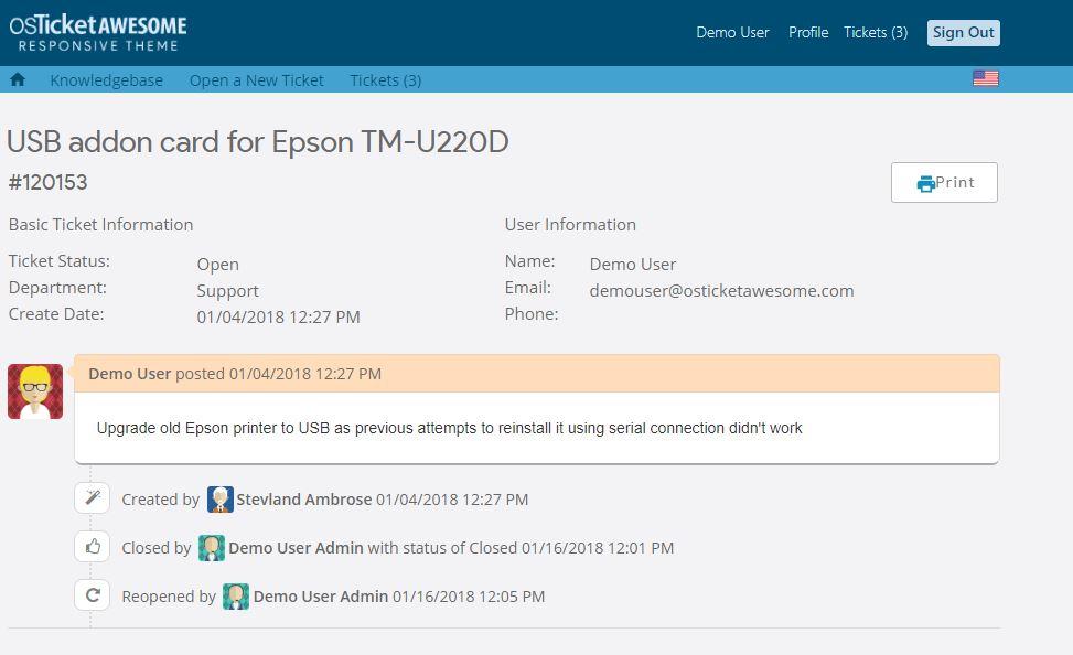
I disagree. There are always a few things I would improve, but I think the Client Ticket View page looks fine. It is highly stylized using CSS. Compare to osTicket core:
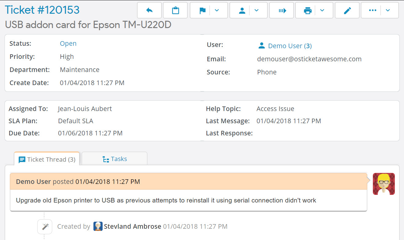
The main difference between the Ticket View page in Client vs Staff is that the info on the Staff side is inside white containers.
Is that what looks better to you? It is something I could consider.
Yep. I know that the client side is styled using CSS....except that table. It's a shame that everything else has the same look and feel but not the main info table.
Just a tiny modification by adding the white container with rounded corners bold titles improves its appearance and does not give the sensation of seeing an HTML fragment of the 90s. IMO.
Please consider also to add a non breaking space between button icons and its title.
Keep up the good work! 🙂
Thank you for your persistent suggestions, @aeromarine.
I have implemented the changes as you've requested, which you can review here.
These changes will be included in the next update.