Have you checked these first?
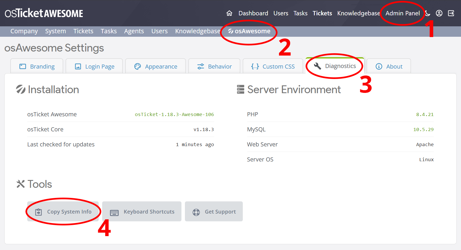
Help us help you: include your environment details. We've made this easy for you. Use the Copy System Info button in Admin Panel › osAwesome › Diagnostics, then paste below.
Note: Never paste the contents of your ost-config.php file here; it holds your database credentials.
Two quick checks before posting: try clearing your browser cache, and press SHIFT+O on any Staff Panel page to enter Safe Mode (a stock osTicket with no enhancements). If the problem still shows in Safe Mode, it's in osTicket itself, not osTicket Awesome. But let us know about the issue either way.
Help us help you: include your environment details. We've made this easy for you. Use the Copy System Info button in Admin Panel › osAwesome › Diagnostics, then paste below.
This forum is public. Never post order numbers, full license keys, email addresses, or payment details.
This is the place for general questions about how billing and licensing work — renewals, activation, staging slots, plan differences, and what happens when a license lapses.
For anything tied to your specific account, refund, or payment, contact us directly instead.
Recently purchased osTicketAwesome and am really liking it so far, the appearance is much better than vanilla osTicket.
I do have a suggestion, although it is very small. The default colors for the Priorities seem to be in the incorrect order in my opinion.
The default color order is as follows: Emergency: RED, High: BLUE, Normal: Green, Low: DARK YELLOW
The normal colors that I (from the USA) would expect for priorities/urgency, would be as follows: Emergency: RED, High: DARK YELLOW, Normal: Green, Low: BLUE
If you Google "color priorities" or for a more direct example "homeland security colors" BLUE is almost always representative of a lower priority than YELLOW/DARK YELLOW
Again this is a very small suggestion, but just something that stuck out to me
+1 I completely agree. it's by far a lot more intuitive.
I see your point, @laroccad.
The color scheme that I've used still makes sense to me, and yet I can't think of any way to justify it. Meanwhile, you have presented a solid case for the red to blue scheme. I see that it is also used in Mexico.
You win. I will update the color scheme at some point. Thanks for the feedback.
I revamped the Priority Colors in the latest release, available as of yesterday.
I revamped the Priority Colors in the latest release, available as of yesterday.