Have you checked these first?
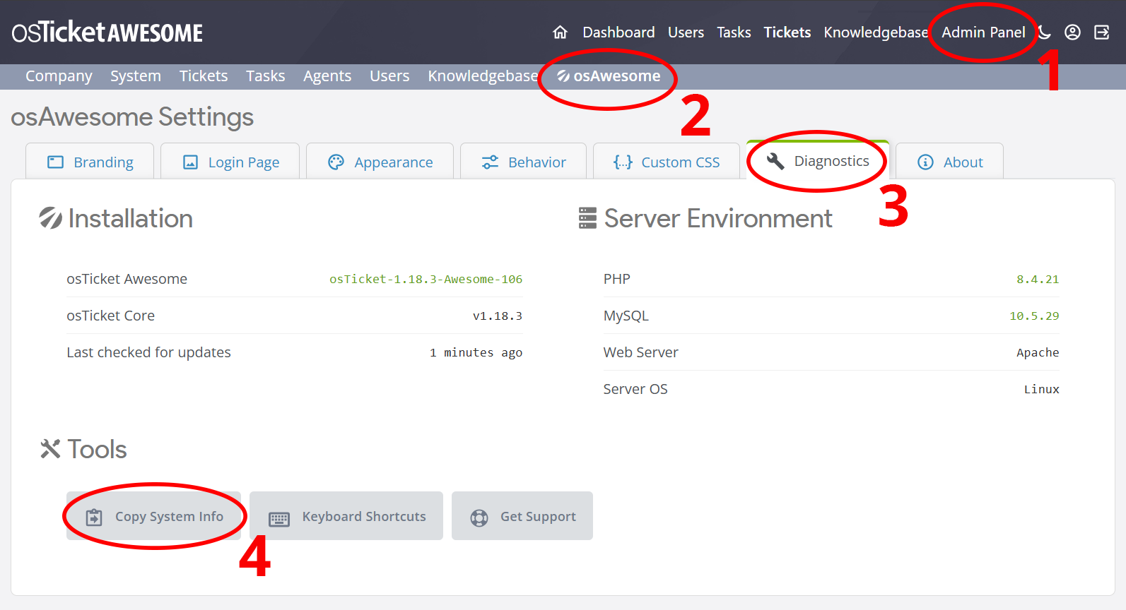
Help us help you: include your environment details. We've made this easy for you. Use the Copy System Info button in Admin Panel › osAwesome › Diagnostics, then paste below.
Note: Never paste the contents of your ost-config.php file here; it holds your database credentials.
Two quick checks before posting: try clearing your browser cache, and press SHIFT+O on any Staff Panel page to enter Safe Mode (a stock osTicket with no enhancements). If the problem still shows in Safe Mode, it's in osTicket itself, not osTicket Awesome. But let us know about the issue either way.
Help us help you: include your environment details. We've made this easy for you. Use the Copy System Info button in Admin Panel › osAwesome › Diagnostics, then paste below.
This forum is public. Never post order numbers, full license keys, email addresses, or payment details.
This is the place for general questions about how billing and licensing work — renewals, activation, staging slots, plan differences, and what happens when a license lapses.
For anything tied to your specific account, refund, or payment, contact us directly instead.
Edit ;
I found your old answer via google : https://osticketawesome.com/forums/topic/text-size-in-menus-and-languages-issues/
Hi,
The font size and font weight used in the top menu bar of the agent and admin panel is not readable (see screenshot). Where can I change it in CSS? Thanks!
I'm glad you found the answer, and I hope you've gotten this sorted. But something is weird about the way the navigation bar is showing in your screenshot. It shouldn't look like that. Before changing the CSS, please try clearing your browser cache to see if that helps.
Yes I did, I also cleared the server cache in case. The ticket client side menu is fine, it's only the agent/admin panel that appear so thin and small.
And you are using the fr français (French) language back, yes?
Not that it should matter what language you're using. I'm just trying to reproduce the issue on my end.
Have you been able to resolve this through custom CSS?
Yes, I use the fr pack. I used the css code you provided, but 500 makes it impossible to know which menu you are in at the moment so I'll play with it a bit.
Also, I'm using Chrome.


Hi, in case this can help your troubleshooting for future release, this is what the same exact install looks like before I start customizing it. Top screenshot is Safari MacOS, the bottom one is Chrome MacOS. I find it surprisingly strange that CSS code can appear so screwed up in Chrome, especially the color of the nav links!
BTW is there a way I can underline JUST the active menu? Otherwise when it's ticker you don't see which one is active...